GRAPHICS 01
Design for presentation
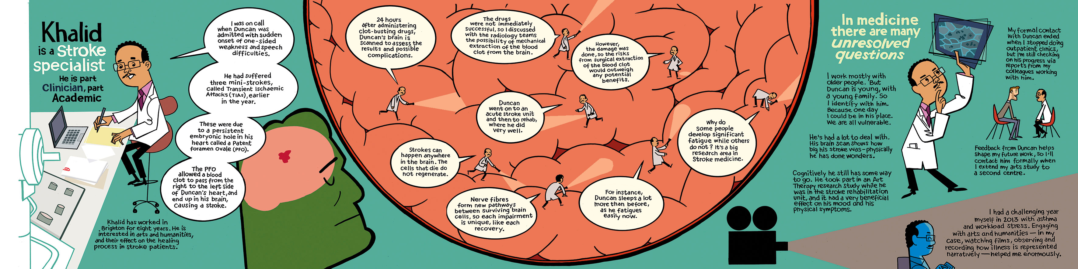
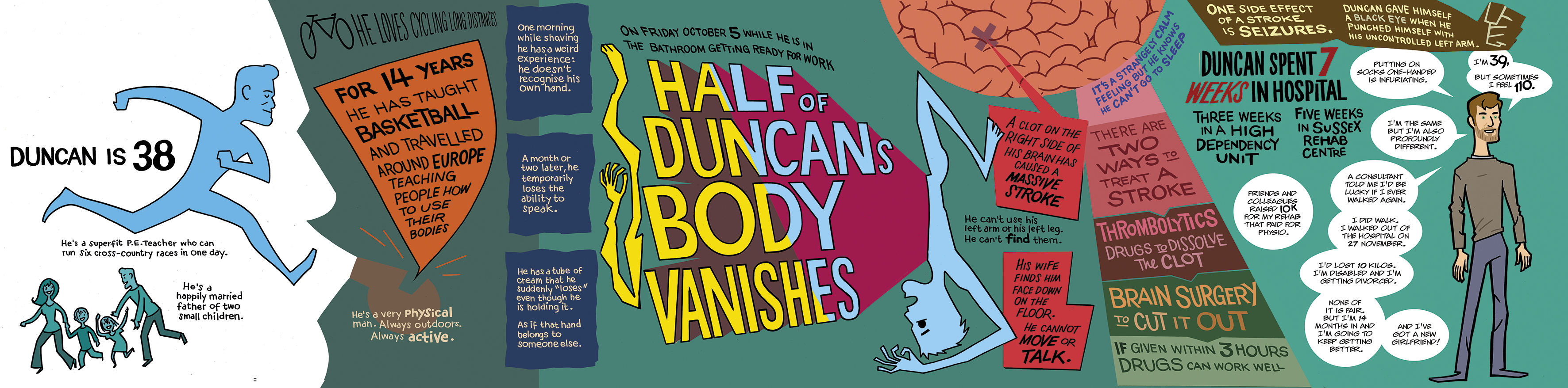


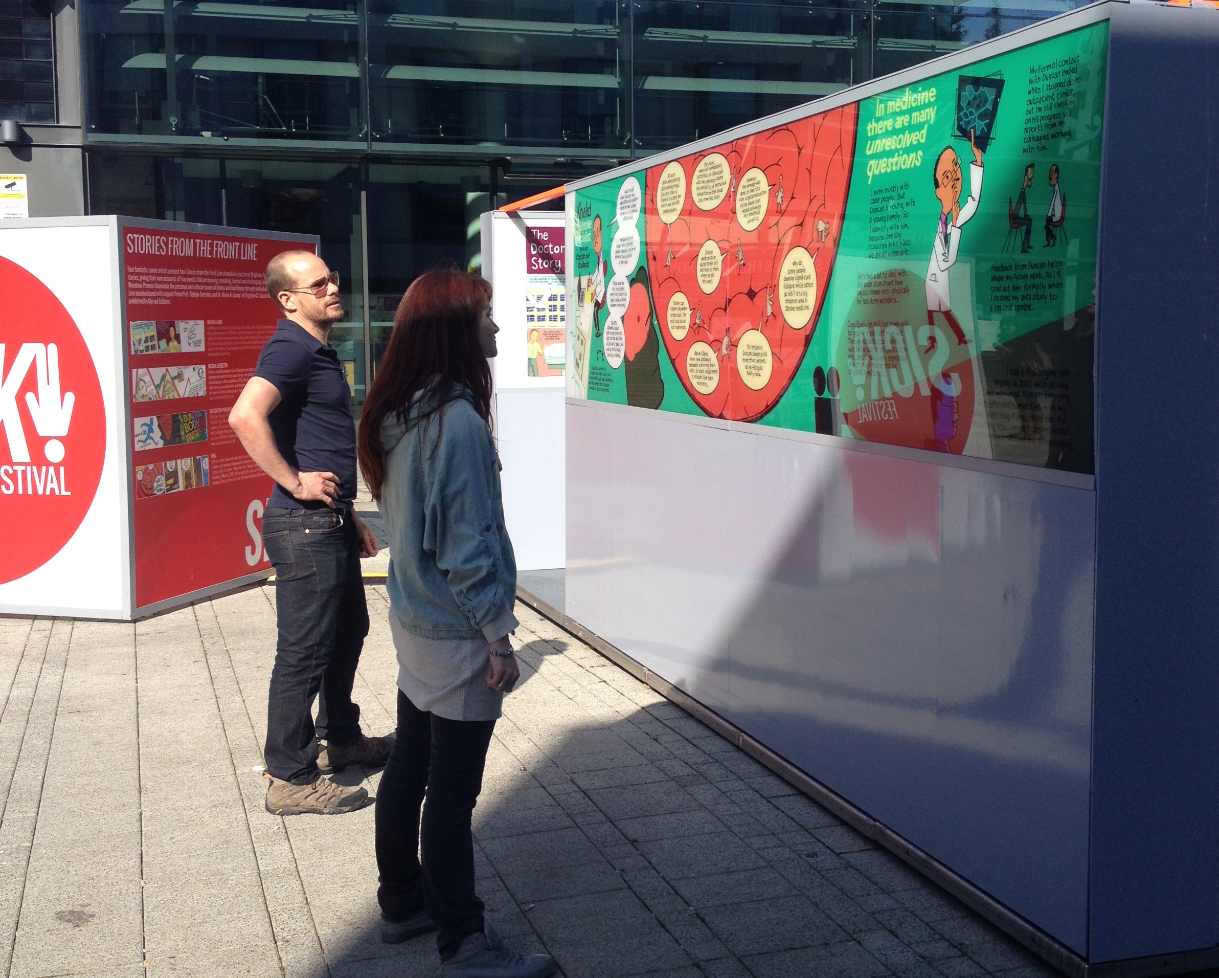

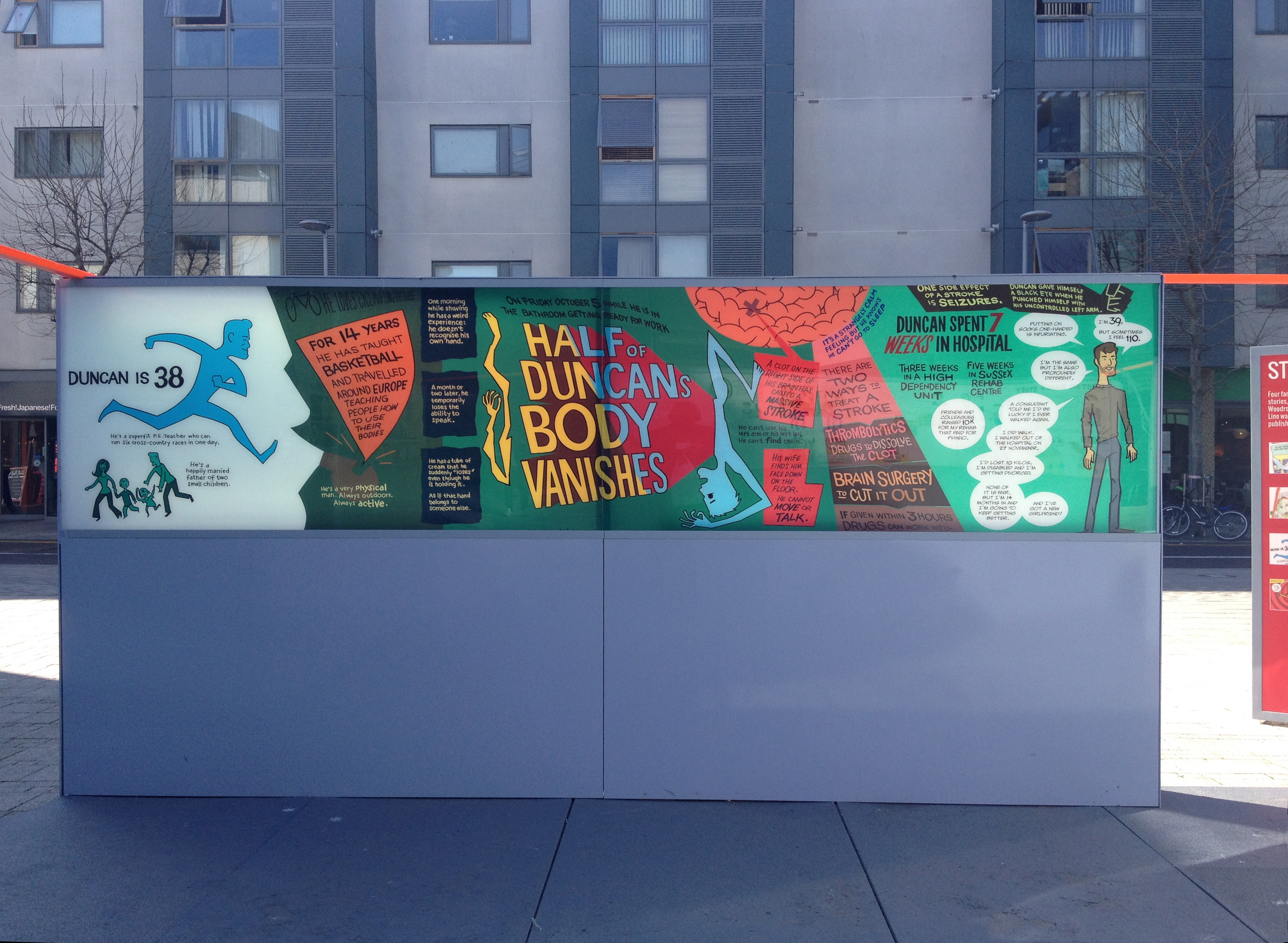


SICK! Festival addresses mental and physical heath issues through public art projects. For Stories from the Front Line I wrote and designed two of a series of large format posters - four metres long - for an outdoor installation at Jubilee Square, Brighton. They explored a life-changing medical incident from the perspective of the doctor and the patient. I interviewed both participants and then created a poster detailing each side of the relationship. They are designed to be graphically attractive from across the street and then to provide all the information smoothly when a viewer is standing in front of them.
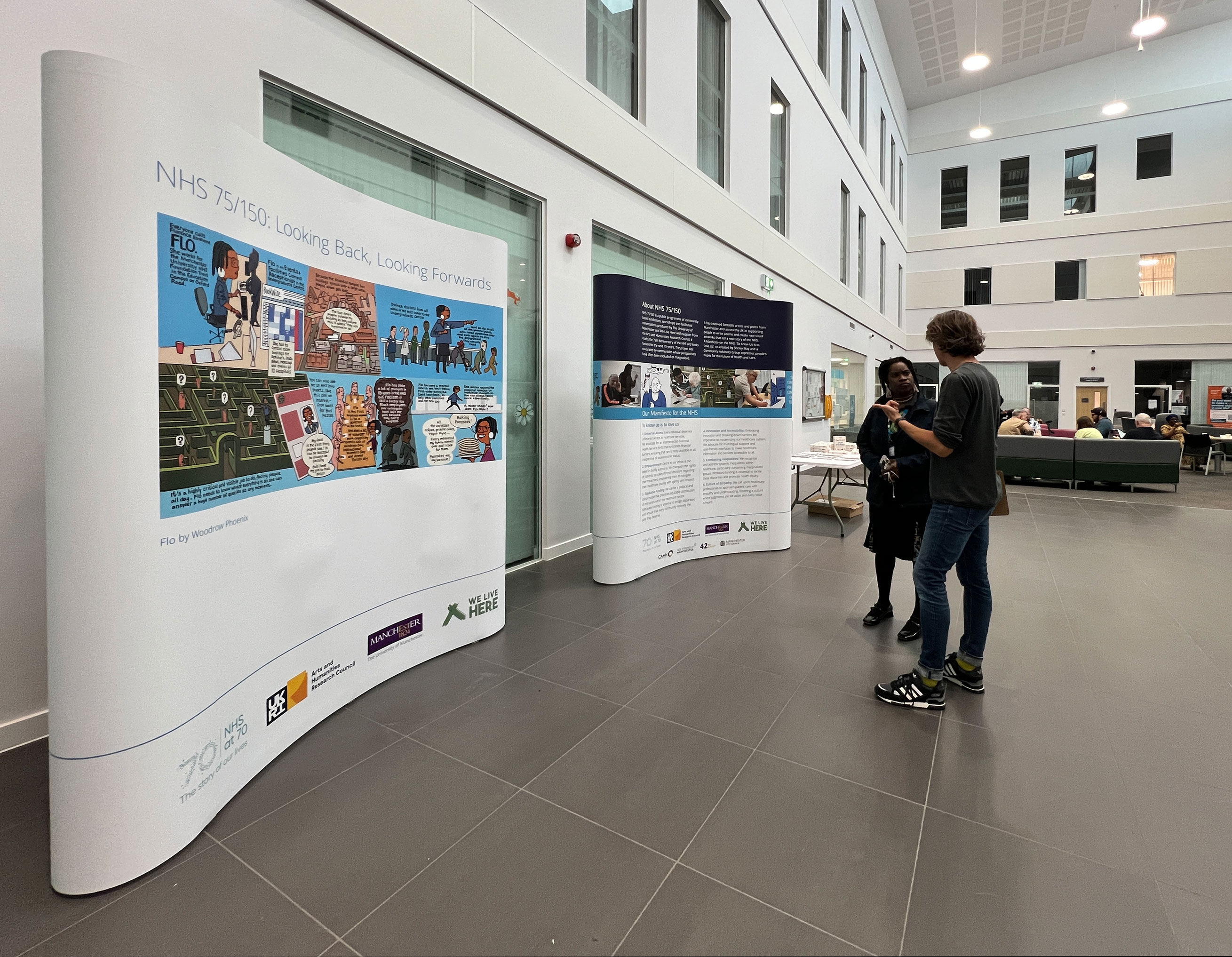
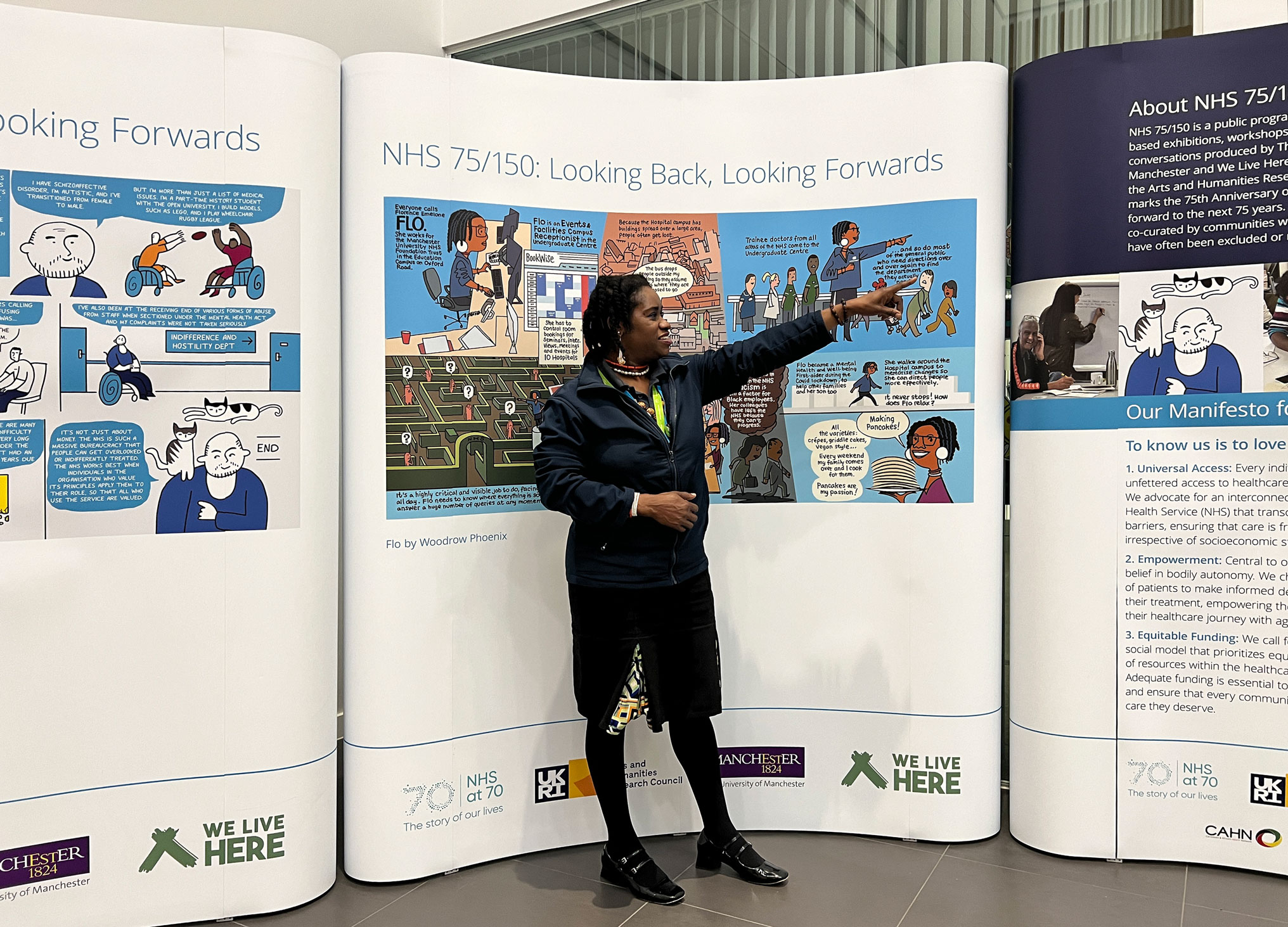
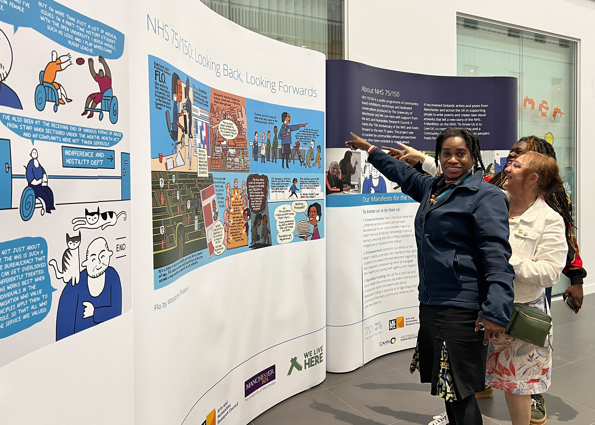

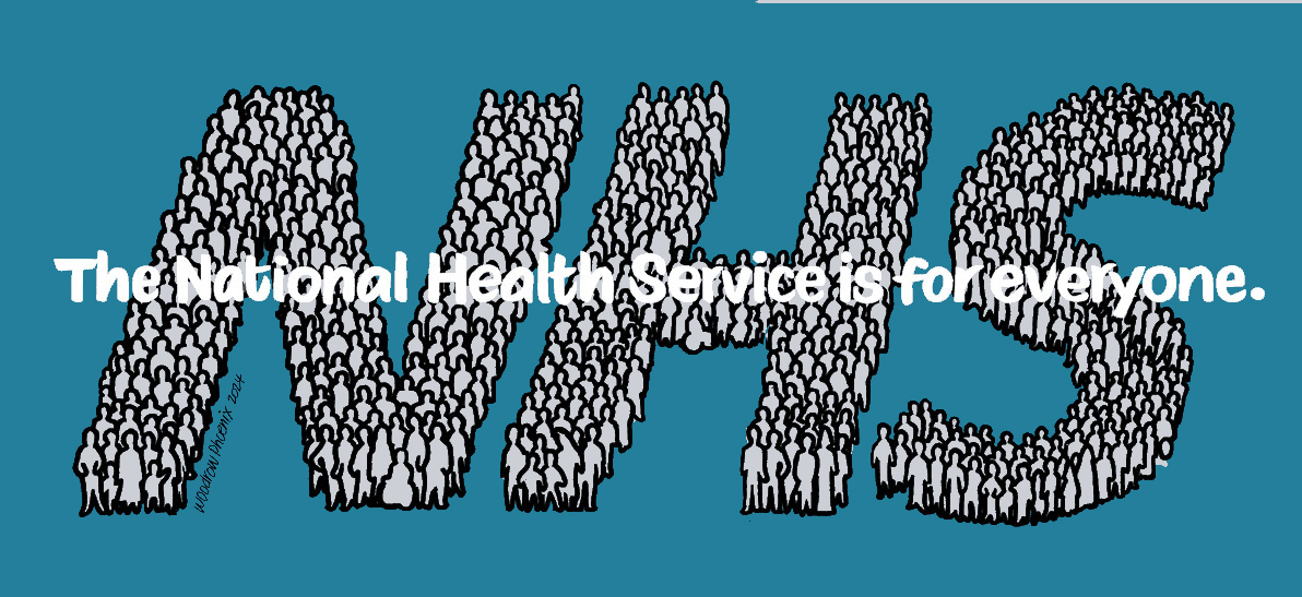
NHS@75 & 150 celebrated the history of the National Health Service in 2024 in a year-long programme of public realm exhibitions in locations across Greater Manchester. I was commissioned to produce two large-format graphic artworks. I spent an afternoon shadowing Florence Emelone, aka Princess FLO, at Manchester Royal Infirmary and turned that into a personal history of her time working in the NHS.

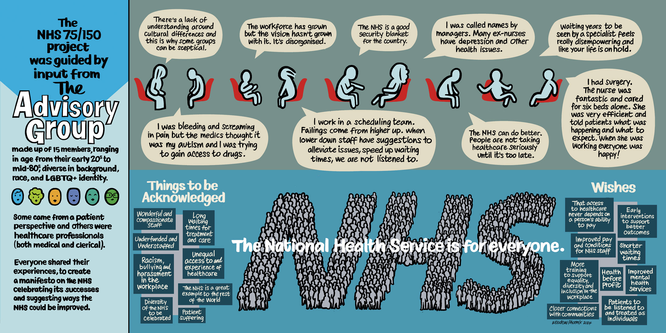
The second large-format graphic artwork explained the process of the advisory group, whose stories shaped the direction and objectives of the project. Key phrases from their experiences informed this piece.
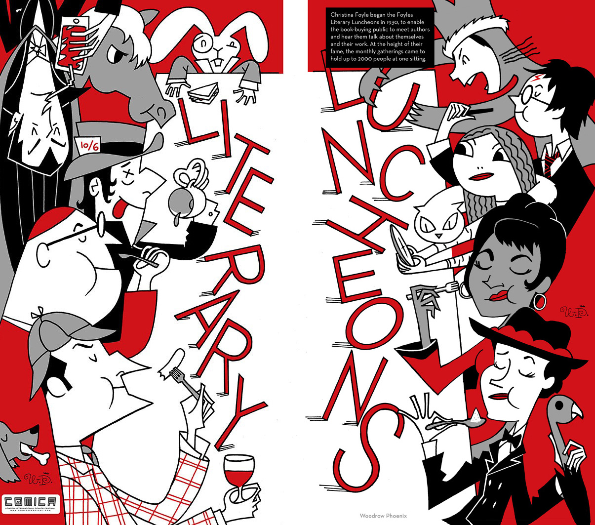


FOYLES Bookshop in Charing Cross Road closed the premises they had occupied for over 100 years to move down the street. While the building work was going on they commissioned a comics history of Foyles in Artists’ Panels to hang on the hoardings that covered up the building work. My two posters featured fictional characters attending one of Foyles’ famous Literary Lunches. John Lennon was the only non-fictional character (except when he appeared in the Yellow Submarine animated film) so I swapped him for Lieutenant Uhura from Star Trek (the original series).


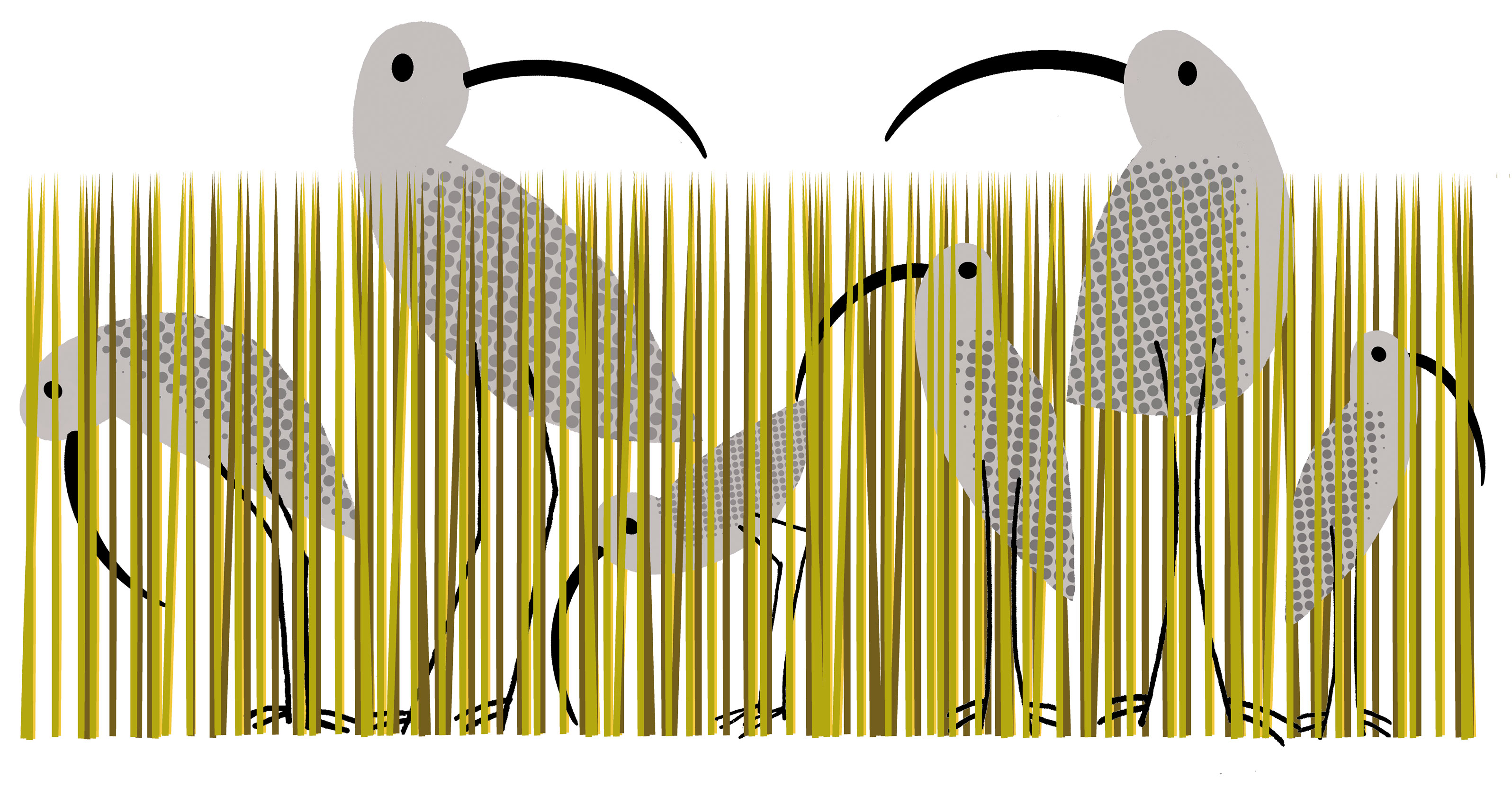
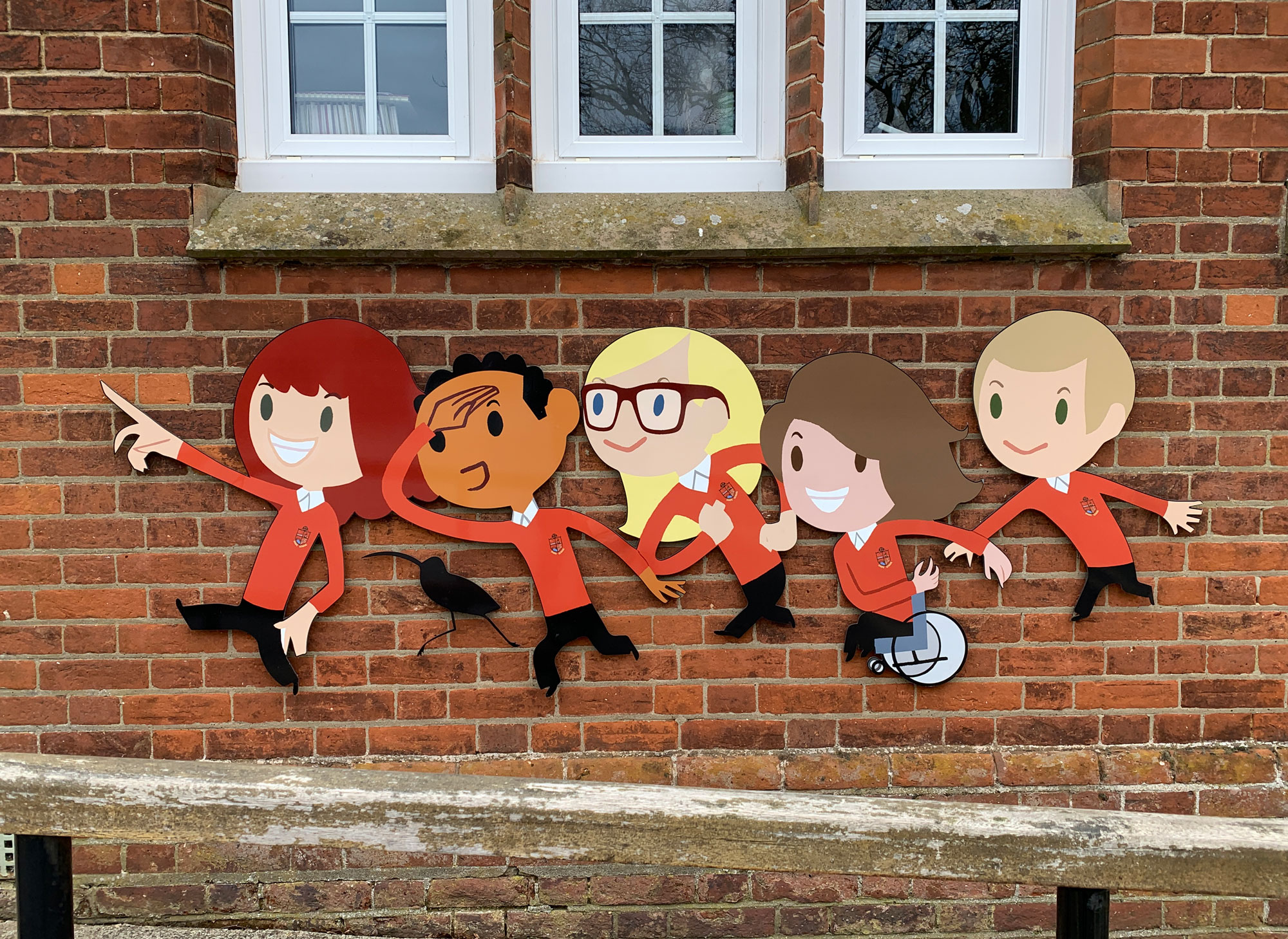
Snape Primary School, the community village school in Snape, Suffolk needed some sprucing up to go with a new head and improved ratings. This image of pupils with a tractor now welcomes all visitors and has created a distinctive school identity. The birds on the gates and fences are Snipes, a local bird. These large scale graphics have radically transformed the front of Snape Primary School and are very popular with the children and their parents.


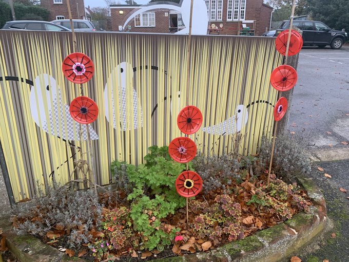
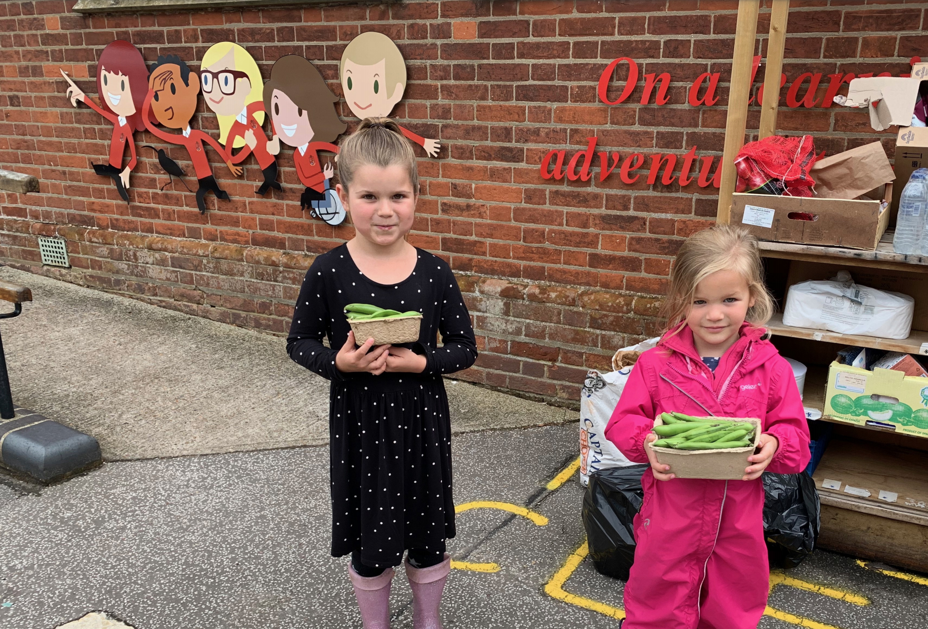
We developed a similar design strategy for Snape Pre-school.


The just-hatched snipes wearing their eggshells like nappies (thanks BMH) is a nice way to keep the iconography going.
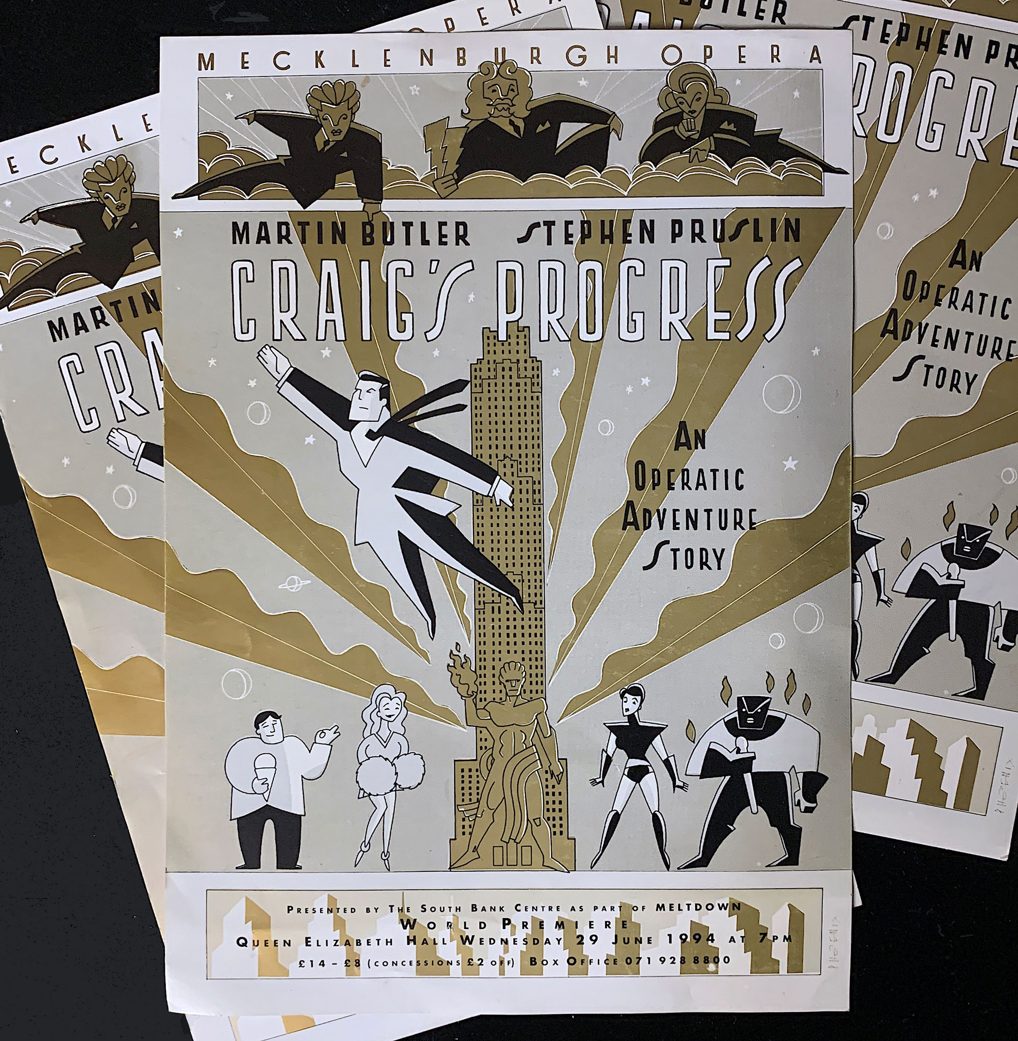
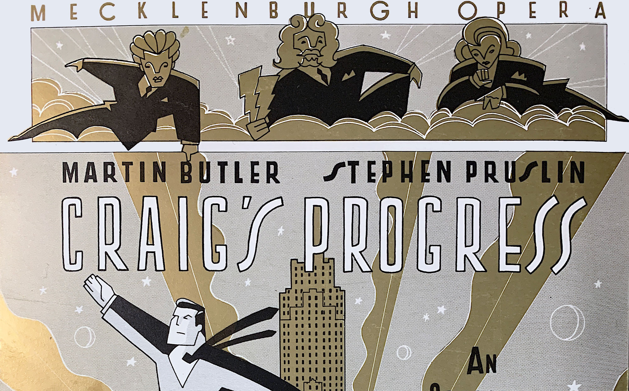
CRAIG’s PROGRESS was an opera commissioned by Mecklenburgh Opera for the South Bank, written by Martin Butler with libretto by Steven Pruslin. I had designed a poster for STREET SCENE at English National Opera before this one. This poster was printed with a gold metallic ink, referencing the Art Deco styling of the NBC Rockefeller Plaza in New York where some of the action takes place. I told Martin I was going to animate this one day. I still might.